
下载应用程序


🎨 Elevate your art game with 24 colors that travel as far as your creativity!
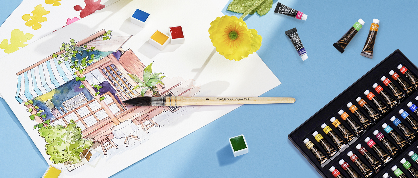
Paul Rubens Watercolor Paint Set offers 24 artist-grade, ultra-pure pigments housed in a stylish, portable metal box with a built-in mixing palette. Featuring removable pans and a professional gum arabic formula, this set ensures vibrant, long-lasting colors with excellent transparency and tinting—ideal for artists, hobbyists, and students seeking premium quality on the go.


| Brand | Paul Rubens |
| Color | 24 Colors |
| Finish Type | Watercolor Paint |
| Size | 24 Count (Pack of 1) |
| Special Feature | Lightweight |
| Unit Count | 24.0 Count |
M**I
Perfect Watercolor Set for Picky Beginner!
I bought this palette as a gift for my mother. She wanted to learn watercolor painting, but the tubes of paint she bought were a little frustrating. With this set, she can easily grab the right color, follow YouTube tutorials, and keep the mess to a minimum. I wanted to give her the best paint set I could on a budget, and after some research, chose this one. She couldn’t be happier! The pigments are rich; the colors are bold and striking. Rewetting and reusing the paint is a breeze- no crumbling, no cracking. The pretty pink metal palette is sturdy and holds the pans nicely. Pans are removable and replaceable. Perfect set for the picky beginner. She’s been enjoying using this set to make custom Christmas cards and tags. While we can’t attest to the longevity of the colors over time, they’re certainly good enough to offer a smooth, premium experience and stunning visual results.
C**.
Beauty is not just skin-deep with this set!
This is a great set for the price. I would recommend this set for beginner artists, crafters, or even more seasoned artists who would like an inexpensive but decent quality paint to practice with. The outside: The packaging for these paints is so nice. It arrives in a very cute cardboard box, and inside the box it is wrapped in a pink microfiber cloth. The metal palette itself is very pretty, and honestly the main thing that drew me to this product in the first place. The inside: All of the half-pans come wrapped with a sticker label that includes the name, pigment information, and lightfastness of each color. In the photos you can see that I stuck these onto a piece of paper to keep as a reference. There is also a swatch card included in the box, which is printed on a sheet of watercolor paper. The paints: They're student grade paints, but the colors are all very vibrant and punchy. For the most part they rehydrate easily, but they don't dissolve so easily that you find yourself quickly running out of paints. I have three student grade watercolor sets (these paul rubens, Winsor and Newton Cotman 12 half pan set, and a set of arteza tubes). Out of those 3 this set is easily my favorite, due to the ease of use and the quality of paints. They are not chalky like the arteza, and they're more pigmented than the cotmans in my opinion. I like the color selection you receive with this set. This particular set has: 3 yellows. 3 reds. 5 blues. With this number of primaries (a nice assortment of cool and warm tones for each), you can mix almost any color you would possibly need. However, you also get a huge variety of secondary colors and tertiary colors, including: 2 violets. 4 greens. 5 earth tones. 2 neutrals. Also, while we're at it, I'll tell you that out of these 24 colors, 20 of them consist of a single-pigment (including every single one of the primaries). 3 of the pigments are made up of a combination of two pigments, and only 1 color is made up of three pigments. If you are a person who tends to prefer single pigment colors, or if you're interested in learning how to mix colors, this is a great set. Tldr; this set is not only pretty on the outside! You definitely won't be disappointed with the contents of this cute palette.
D**.
Made me love watercolors again! *Technical stuff in Review*
LANGUAGE SOLUTION: I just want to preface this with saying, people, the color/pigment info is in English on this exact listing, in the images (NOT the Product Description, but at the TOP of the page within the image slideshow.) Reference the pigment info on the half pan wrapping with the pigment listed in the third image on this listing page! If the wrapper for the sky blue says "PB36" with a number “8” in the next line, look at the image and you'll see that the Sky Blue color is indeed that exact color with having PB36 as a pigment and a Lightfastness of 8. Do that for each color. I have an image that can help as a guide in this review. You can also use your phone camera with a translator to translate it in English for you. Trust me, I was lost at first but it was not hard to realize that the brown color with PBr7 and PR101 and 8 on its wrapper was the "Umber" color in the color chart image on this listing. Don't let the language distract you from testing out whether the paint was worth your buy! The language isn't the selling point, the paint is! Returning the paint because the language is Chinese and just because PR is a Chinese brand is.. kinda weird. With that, hope my review below helps! _______________ This watercolor set is really amazing for the price! Originally, I was going to buy $100+ worth of watercolor tubes and supplies, but I decided on getting this 24 set after coming across some videos reviewing it. I noticed that PR sells two versions of the 24-set in their "Professional" line. The one I bought has metal-based pigments with Cadmium and Cobalt, and doesn't have a white. It's wild how amazing this set is for the price listed. PR probably adds some sort of white filler in the colors, and it may be noticeable to some experienced watercolor painters, but it didn't hinder the vibrancy and saturation of the colors. The colors are easy to blend, they don't mud so easily and they don't patch up on the surface either. Compared to other cheap watercolors around this price, the fillers are honestly barely noticeable (if there are any fillers) and it's like painting with more expensive professional grade watercolors. Fillers are a big deal to me (esp with gouache, i'm *very picky* with paint w/o fillers, opacifiers) and I'll tell you these paints are worth it if you are a beginner. Pros of this set are that the colors are vibrant, they rewet easily and go on smoothly. The color selection is great, but the Madder Red is made with PR177 and it's not a lightfast pigment. Kimberly Crick tested the lightfastness of these pigments on her website, and the Madder Red fades. Prussian Blue PB27 is also a pigment that fades, but I appreciate that the company didn't rate it a 7 or 8. The Indian Yellow (PY83) is given a 7, but the pigment used fades when diluted throughout many brands. These three colors are absolutely gorgeous but I would relegate it to sketchbook work if you worry about lightfastness. Fugitive pigments/pigments prone to fading are listed below (tested by Kim Crick): 1) PY83 Indian Yellow 2) PR177 Madder red 3) PB27 Prussian Blue (fades in strong light, but recovers in darkness, tread carefully) 4) *NOTE* PG36 PY12 PR101 PW5 Tree Green in this set is prone to fading, but the same color listed elsewhere in the PR Watercolor catalog lists Tree Green with PG7 PY3 PR101 PW4 (lightfast pigments, PY3 being less lightfast but okay), but to be safe I put it away. A little extra info: I modified the palette and removed the Coal Black (PBK7), Paynes Grey (PB15, PB29, PBK9) and the Pozzuoili Red Ochre (PR101), and replaced it with a full pan of Zinc White, and a half pan of Titanium White (both whites were from another brand). Later proceeded to remove the Prussian blue, Indian Yellow, Tree Green, Violet, Scarlet, and Madder Red and will replace them with similar colors from this same Paul Rubens brand (the replacement colors were bought from another website). Also put away the Burned Sienna because the hue can be mixed with Umber and Burned Brown. Fun fact, an extra half pan can fit in the middle slot of the palette, but sideways. Overall, this set is great, and vibrant colors and clean mixes it makes for the listed price makes it even better! If you want to use it for professional work, I believe using a scanner to reproduce the image, replacing the fugitive colors with lightfast alternatives, or removing the fugitive colors entirely and using just the colors that are actually lightfast will suit you well. If you are using this product for practice, sketchbook works, or for projects that don't require lightfast paints, this will be absolutely perfect. I do not regret purchasing this set, and from a person that hasn't painted with watercolors in a long time, this made me fall in love with the medium again! ____________ UPDATE: In order to shorten the (now gone) updates, I'm just gonna recommend some palette changes. Colors I replaced (replacements are lightfast) 1. PY3 Lemon Yellow —> PY35 Cadmium Lemon Yellow (virtually the same color but lightfast) 2. PY83 Indian Yellow —> PY110 Permanent Dark Yellow (virtually same color but lightfast) 3. PR123 Scarlet —> PR254 Chinese Red (Ferrari Red, more vibrant counterpart, lightfast and reliable) 4. PV19 Red Violet —> PR122 Magenta (very lightfast according to handprint’s tests, more saturated than PV19, makes better purples with Ultra Blue) 5. PV23 Violet —> PV15 Ultramarine Violet (more lightfast and more saturated) 6. PG36 PY12 PR101 PW5 Tree Green —> PG50 Cobalt Green (less dark valued but completely lightfast and a nice green) Other colors I recommend adding are 1. PY150 Nickel Yellow (a duochrome yellow, earthy in masstone, but becomes a vibrant lemon-mid yellow when watered down. Nice for green mixes and painting light) 2. PB36 Cobalt Turquoise Light (lightfast and vibrant color, great for sky blues, sea tones and green mixes) 3. PW4 Zinc White & PW6 Titanium White (not a watercolor purist, white is okay to use. I bought different brands. PW4 for mixing and PW6 for highlights. Don’t overuse these) Other colors I removed but didn’t replace 1. PR177 Madder Red (gorgeous color but not lightfast at all. Recommend it for sketchbook use) 2. PB27 Prussian Blue (beautiful color but lightfastness is iffy. Recommend it for sketchbook use) 3. PG17 Chromium Green Oxide (oddly enough this usually lightfast color fades in this brand, but like Prussian Blue it regained its normal look after some time away from light. Very iffy, so removed) 4. PB15 PB29 PBk9 Payne’s Grey & PBk7 Coal Black (you don’t need to remove them but I do recommend mixing your dark colors without pigment black)
K**E
Very Nice Watercolors - Excellent Value!
Let's start with how beautifully packaged this product is. The packaging alone makes it a great gift for any artist friends. The paints are great quality, too. There are a gorgeous variety of colors in this nicely sized 24 pan set. They are very rich and vibrant and move with ease in wet-to-wet and wet-to-dry applications while blending together well. While the quality isn't on par with Daniel Smith, Winsor Newton, Schminke, Holbein and Maimeri Blue, they are nonetheless a great value for the money. I purchased these for those times when I'm traveling and don't want to risk losing my very expensive professional paints. My one complaint is the swatch card is not in English so you don't have the color name. They are lusted on the pan wrappers, however. I would advise when you unwrap your individual pans, be sure to make note of the color on your swatch card.
M**.
Don't Cheap Out, Invest in Perfect Paints
If you have advanced past kid supplies, discount Michael's brands, or learning/student palettes, this is all you will ever need as an amateur artist or serious hobbyist. These are half the price of Windsor Newton, a third of Schmincke Horadam, and still runs about $20 cheaper than 10 tubes of Daniel Smith. Don't be swayed by bigger discount sets with a huge range of colors, including metallics. These 24 colors are all you need and have the usual spread of warm and cool tone versions of each color. The mixes are subtle, while the paint themselves are vibrant while still having all the top tier qualities for pigment density non-staining, lightfastness, and transparency. The packaging is the best around. It comes in a heavy box, paints are in a metal tin that allows for mixing pans on both sides, each pan is full and individually wrapped, and it includes a microfiber cloth. I received this as a Christmas gift (the set had dropped to $38 on Black Friday) and it really felt like something special when I revealed it. After adjusting to the paint density and new water control, I've been absolutely blissed out by the quality. I'd say these are a good step above Arteza paints, which are still very strong middle quality paints, and I infinitely prefer these to similar Japanese produced paints, like Kuratake (the pans of which are never filled fully). It absolutely blew away my first practice set, the 40 pan Komorebi (also not filled all the way even if I did like the metallics). This paint makes a world of difference and takes my work to that next level for eye catching vibrancy and quality. It's a pleasure to work with on the brush and with water. ABSOLUTELY recommend, hands down, as the best available on Amazon and comparable to professional grade paints for a fraction of the price.
K**T
Professional quality pigments!
High pigment load, easy to activate with a wet brush, react as expected with salt and disperse normally in water. For as cheap as this set was, compared to my other professional grade watercolors like Schmincke Horadam, Winsor and Newton Professional, Sennelier, Rembrandt etc, I am astoundingly impressed. I am actually sad I bought all those expensive sets! A whopping 20 of the 24 colors are single pigment colors (not mixtures, that can be prone to muddying when further mixing colors). All of which were labeled with both color names and the pigment ingredients, and they used nice quality lightfast ones. This is an ideal set for those who paint small or infrequently, as half pans are fairly small. It's a great set for professional artists also just starting out or needing a travel palette, who later plan to refill the empty pans with more economical tubes from companies such as Daniel Smith or Mission Gold. Most of these pigments can be found in all professional artist quality paint brands. There are unique colors in this set not typically found in 24 color selections, such as the granulating cobalt and cerulean blues. The worst part about the color selection is it is missing a bright primary magenta. You can still mix a great deal of colors from this set, as there are several shades of blue red and yellows, however it will be hard to get those vibrant floral pinks. However, unlike almost every other set I have, they did not include a useless white watercolor that many companies throw in because it is cheap. White watercolor is so transparent that it does not work well for mixing, if you wanted a lighter shade you add more water, if you want opaque pastel you would use white gouache instead - so I'm really glad they didn't include white. As of May 2018 this item also appears to be the same as the blue box version for 5 dollars less (about 40 dollars vs 45 called MEEDEN 24 Colors Artist Professional Watercolor) and the images both show the Paul Rubens name (based on the old artist Peter Paul Rubens, not the actor pee-wee herman).
M**Y
Beautiful Paint at that price point
Beautiful paints at that price point. The only issue with paints is the three browns they include are way to similar. That being said the other colors are gorgeous . It has a nice flow and glazes well as long as you don’t overwork at all. The paints all have a low staining characteristic which can cause lifting even after the paint has dried. And this was on Arches cold press paper. I had issues with with prime pricing, delivery delays and customer service but when I finally spoke to a rep after I received it they were so professional and helpful. Chat support people were not helpful. But in the end Amazon did the right thing!!!
C**I
Great starter set! The greens are so pretty.
Great starter set. Vibrant colors! This was what I started with. The greens are so pretty and vibrant.
TrustPilot
2 周前
2 周前